UI
UI
UX
UX
UX Research
UX Research
Email Marketing
Email Marketing
Jan 2023 - Mar 2023
Jan 2023 - Mar 2023
Tinman Onboarding Screens
Tinman Onboarding Screens
Tinman Onboarding Screens
Better has digitised the mortgage space with its unique products which help Americans on their path to home ownership. The Tinman dashboard is where users manage their home loan journey after completing their initial application.

The solution:
Task based approach:
Make the user do simple interactions with Tinman interface and let them get real time feedback of how their interactions result in a certain activity take place.
(
Eg. video games introducing their controls to the gamer.)
Get the user to complete a small little task and get a task check off under their belt, while also, introducing the user to the interface.
Depending on different types of users, we can also prompt with tooltips at different stages in the customer journey and bring these mini onboarding flows into play.
Inculcate the tooltip to have headers, ctas, and play with colors.
The problem:
Once users completed the pre-application process and landed in the Tinman dashboard (Better.com’s internal mortgage application tracker), we observed confusion and drop-offs during the first-time experience. Analytics revealed:
Over 28% of users dropped off or went inactive within 24 hours of account creation.
Session recordings and support tickets indicated users didn’t understand what to expect next in the home loan process.
The dashboard had multiple features and action points (document upload, milestones, chat, rate locks, etc.) with no guided entry point, leading to decision fatigue and hesitation.
This unclear post-signup experience was impacting early engagement—a crucial point in the customer lifecycle.
The context:
The Tinman dashboard is where users manage their home loan journey after completing their initial application.
The mortgage process involves multiple stakeholders (underwriters, processors, agents) and steps, which can feel overwhelming.
Industry studies show that:
86% of users say they’re more likely to stay loyal to a business that invests in onboarding (Wyzowl, 2023).
A well-designed onboarding experience can improve activation rates by up to 50% (Userpilot, 2021).
In fintech and mortgage platforms, onboarding clarity is directly tied to trust and conversion—especially in high-value, long-cycle products like home loans.
Better.com needed to improve its first-time experience in Tinman to boost engagement, reduce support load, and guide users toward successful completion of their loan journey.
The problem
Once users completed the pre-application process and landed in the Tinman dashboard (Better.com’s internal mortgage application tracker), we observed confusion and drop-offs during the first-time experience. Analytics revealed:
Over 28% of users dropped off or went inactive within 24 hours of account creation.
Session recordings and support tickets indicated users didn’t understand what to expect next in the home loan process.
The dashboard had multiple features and action points (document upload, milestones, chat, rate locks, etc.) with no guided entry point, leading to decision fatigue and hesitation.
This unclear post-signup experience was impacting early engagement—a crucial point in the customer lifecycle.
The context
The Tinman dashboard is where users manage their home loan journey after completing their initial application.
The mortgage process involves multiple stakeholders (underwriters, processors, agents) and steps, which can feel overwhelming.
Industry studies show that:
86% of users say they’re more likely to stay loyal to a business that invests in onboarding (Wyzowl, 2023).
A well-designed onboarding experience can improve activation rates by up to 50% (Userpilot, 2021).
In fintech and mortgage platforms, onboarding clarity is directly tied to trust and conversion—especially in high-value, long-cycle products like home loans.
Better.com needed to improve its first-time experience in Tinman to boost engagement, reduce support load, and guide users toward successful completion of their loan journey.
The solution: A task based approach
Task based approach:
Make the user do simple interactions with Tinman interface and let them get real time feedback of how their interactions result in a certain activity take place.
(
Eg. video games introducing their controls to the gamer.)
Get the user to complete a small little task and get a task check off under their belt, while also, introducing the user to the interface.
Depending on different types of users, we can also prompt with tooltips at different stages in the customer journey and bring these mini onboarding flows into play.
Inculcate the tooltip to have headers, ctas, and play with colors.
The problem:
Once users completed the pre-application process and landed in the Tinman dashboard (Better.com’s internal mortgage application tracker), we observed confusion and drop-offs during the first-time experience. Analytics revealed:
Over 28% of users dropped off or went inactive within 24 hours of account creation.
Session recordings and support tickets indicated users didn’t understand what to expect next in the home loan process.
The dashboard had multiple features and action points (document upload, milestones, chat, rate locks, etc.) with no guided entry point, leading to decision fatigue and hesitation.
This unclear post-signup experience was impacting early engagement—a crucial point in the customer lifecycle.
The context:
The Tinman dashboard is where users manage their home loan journey after completing their initial application.
The mortgage process involves multiple stakeholders (underwriters, processors, agents) and steps, which can feel overwhelming.
Industry studies show that:
86% of users say they’re more likely to stay loyal to a business that invests in onboarding (Wyzowl, 2023).
A well-designed onboarding experience can improve activation rates by up to 50% (Userpilot, 2021).
In fintech and mortgage platforms, onboarding clarity is directly tied to trust and conversion—especially in high-value, long-cycle products like home loans.
Better.com needed to improve its first-time experience in Tinman to boost engagement, reduce support load, and guide users toward successful completion of their loan journey.
The solution:
Task based approach:
Make the user do simple interactions with Tinman interface and let them get real time feedback of how their interactions result in a certain activity take place.
(
Eg. video games introducing their controls to the gamer.)
Get the user to complete a small little task and get a task check off under their belt, while also, introducing the user to the interface.
Depending on different types of users, we can also prompt with tooltips at different stages in the customer journey and bring these mini onboarding flows into play.
Inculcate the tooltip to have headers, ctas, and play with colors.
Landing screen for Tinman
Landing screen for Tinman
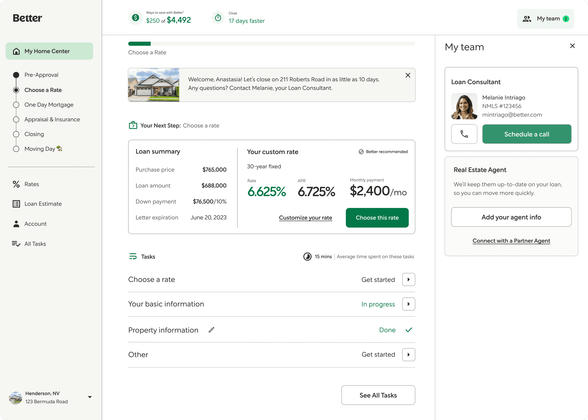
While tinman is quite an extesive dashboard, with a multitude of features and tools at the user's disposal, we initially only wanted to focus on the basics. Hence we started with designing an onboarding experience which tackles the basics, i.e. the landing page.
This page is the gateway to everything that is achievable through tinman. The user can perform all the necessary tasks from this screen itself, without getting lost in the depths of the tool. The tool gives clarity of the actionable tasks, a tracker of user's progress in the loan process, customisation of their rate, and a dedicated help section where they can access the FAQs and also get in contact with their loan officer and their real estate agent. The interface empowers users to move forward confidently—even without a financial background.
Design Iterations
Design Iterations
Design Iterations
After analysing multiple onboarding and intro flows for a lot of products, I boiled down to 3-4 types of designs I wanted to try. I wanted to first try a full screen modal with a 2 column approach. In the left column we the text, and on the right, we have the supporting images. However, this approach felt a bit disconnected, since the user was not actually doing any tasks, but rather just getting a tutorial on how to do so. Post this, I stuck to more overlay modal approach, which were targeted on getting simple tasks done.
Final Design
Final Design
Features of final design
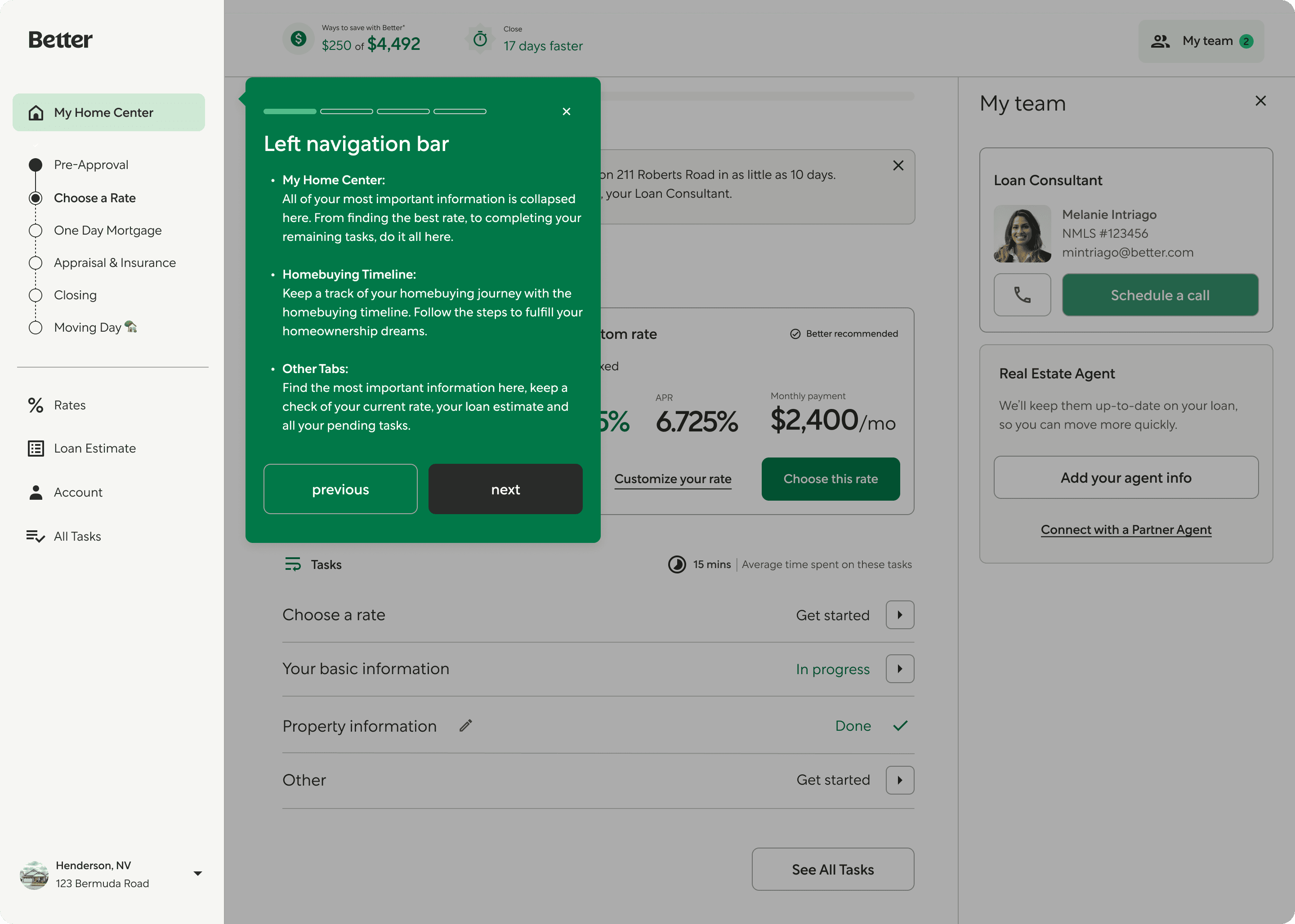
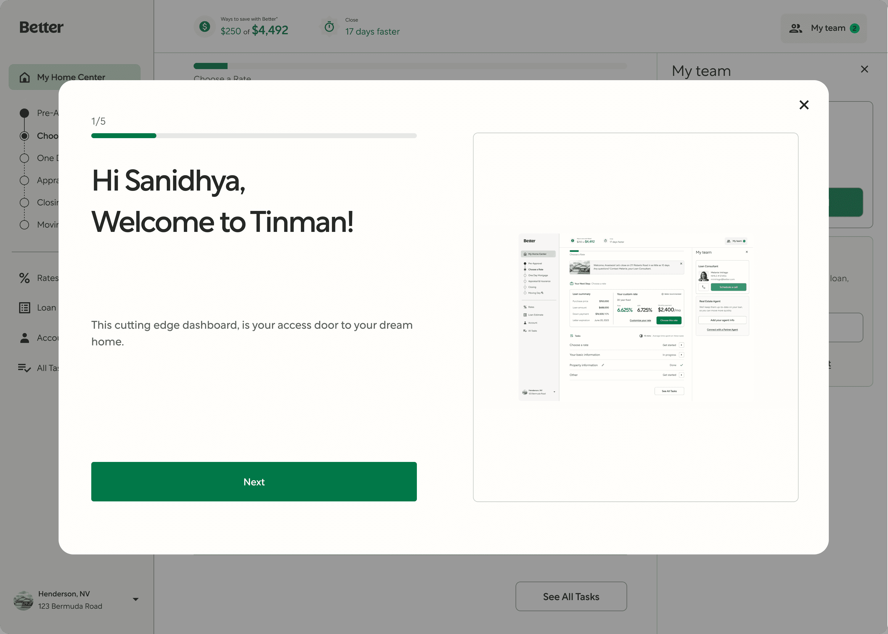
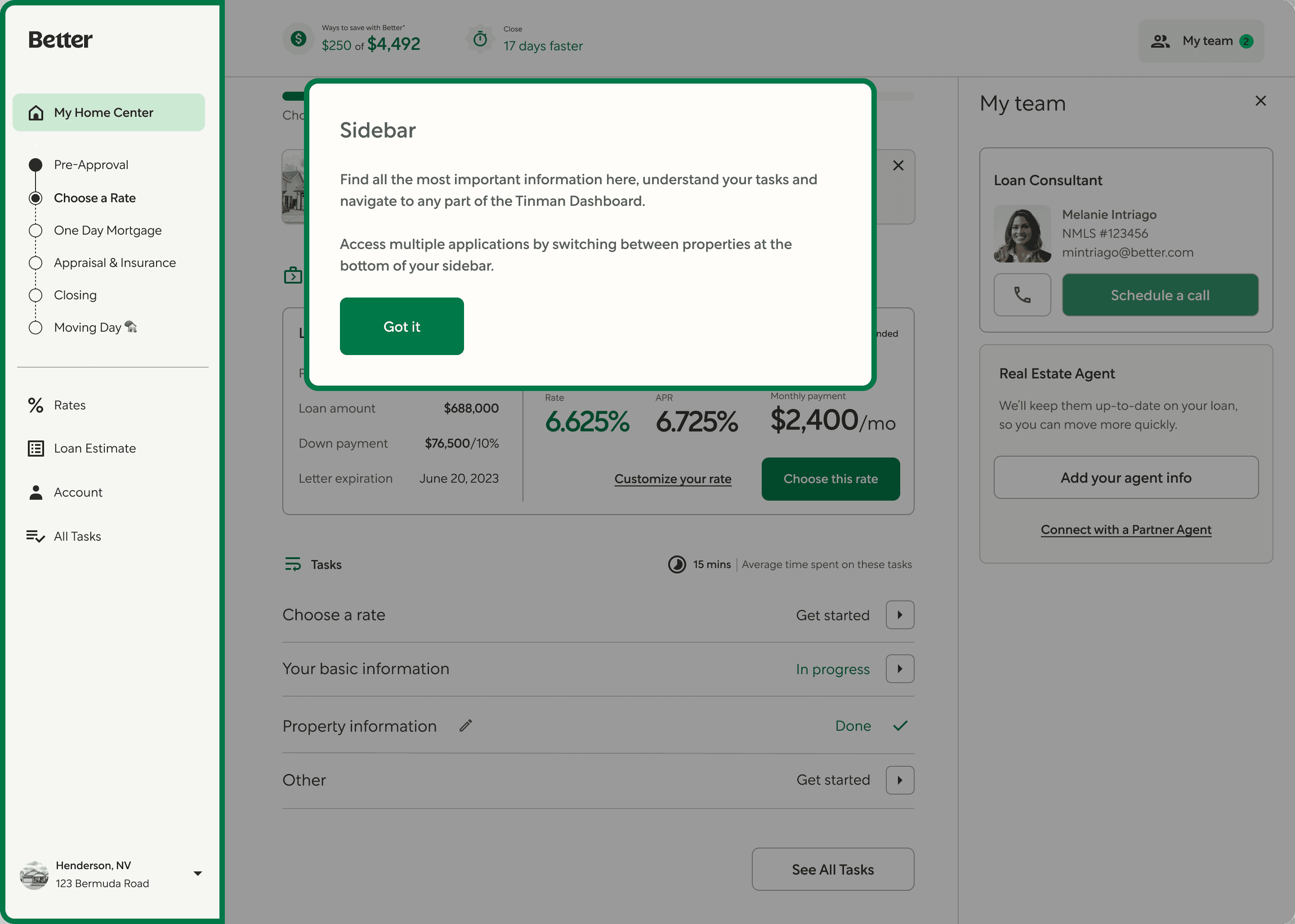
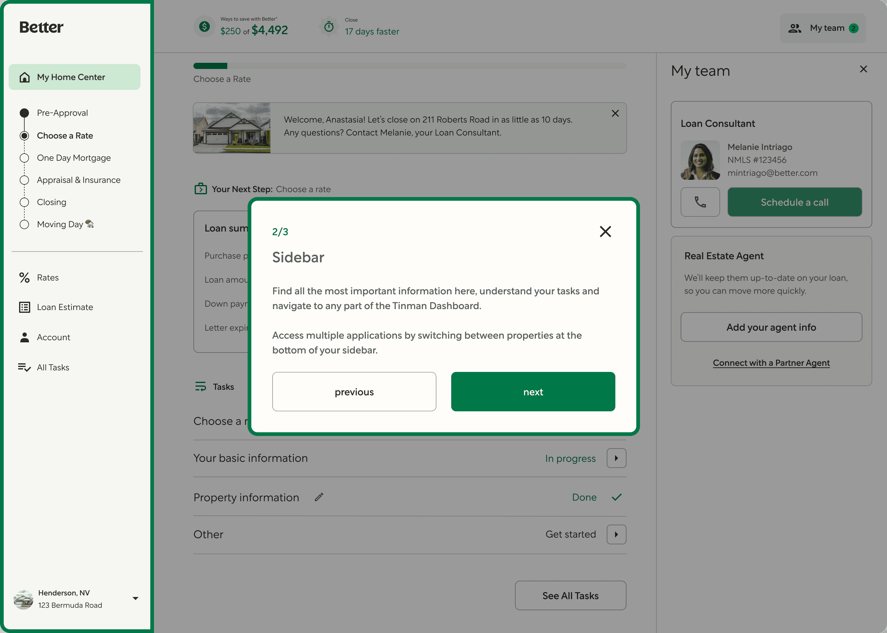
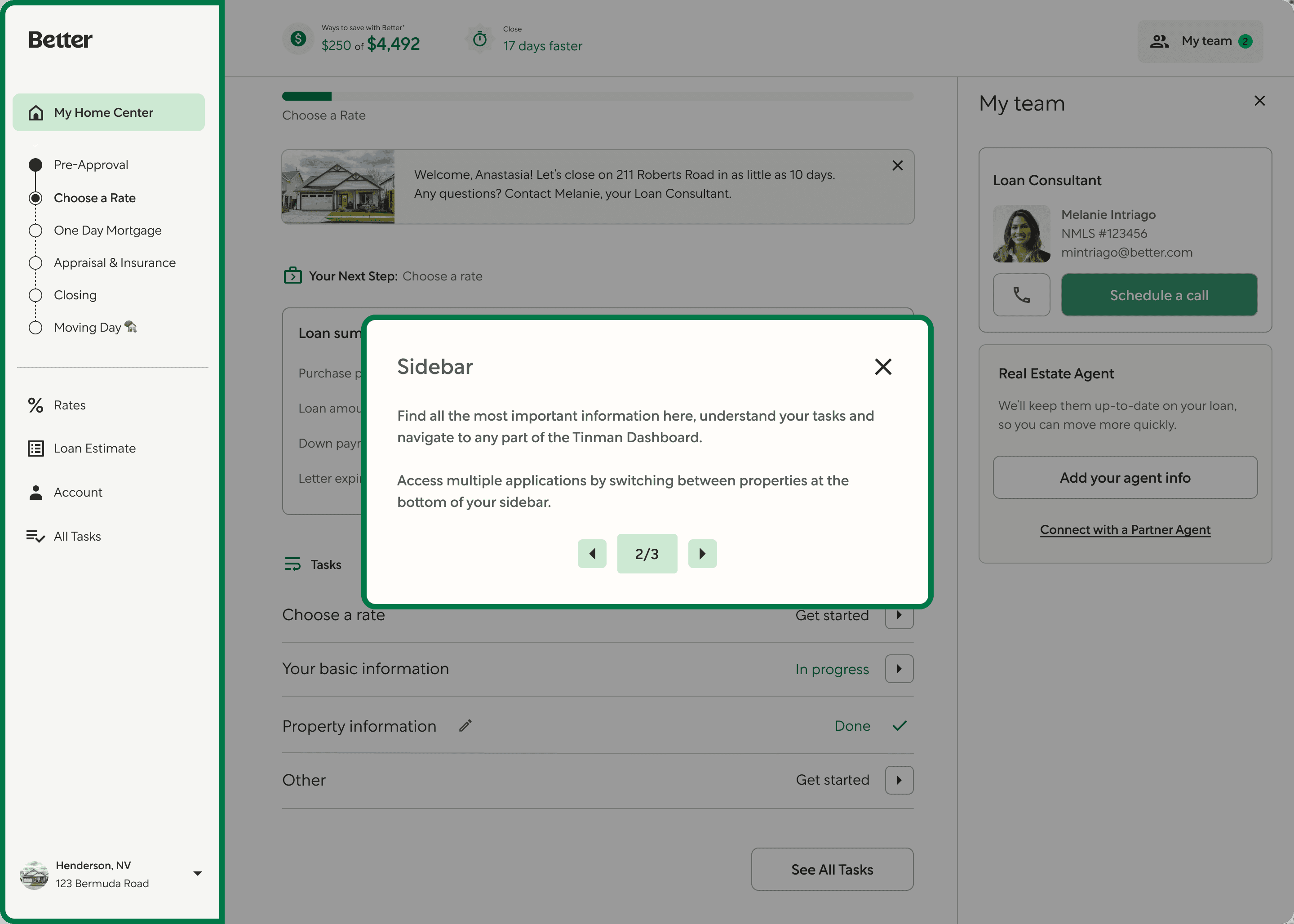
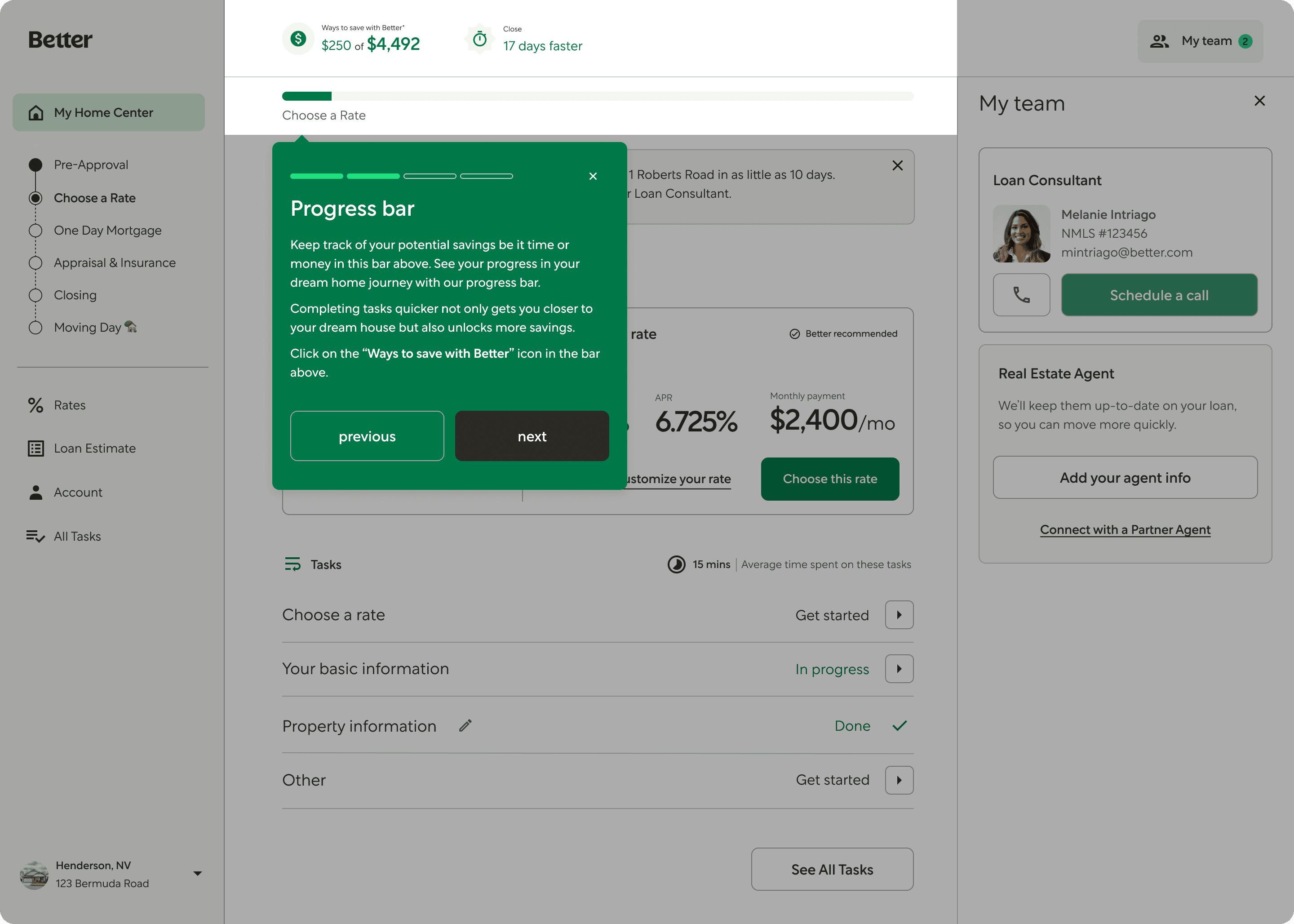
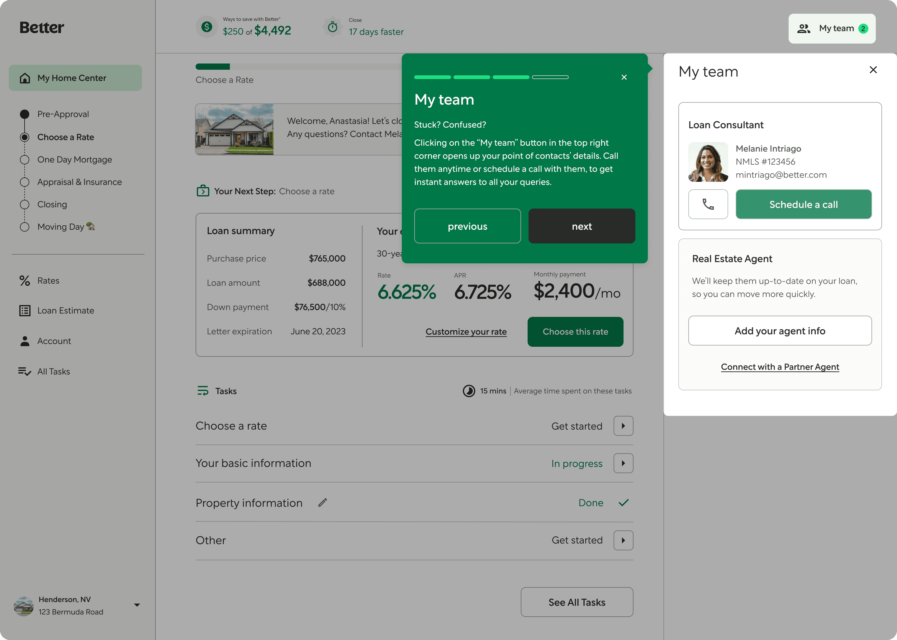
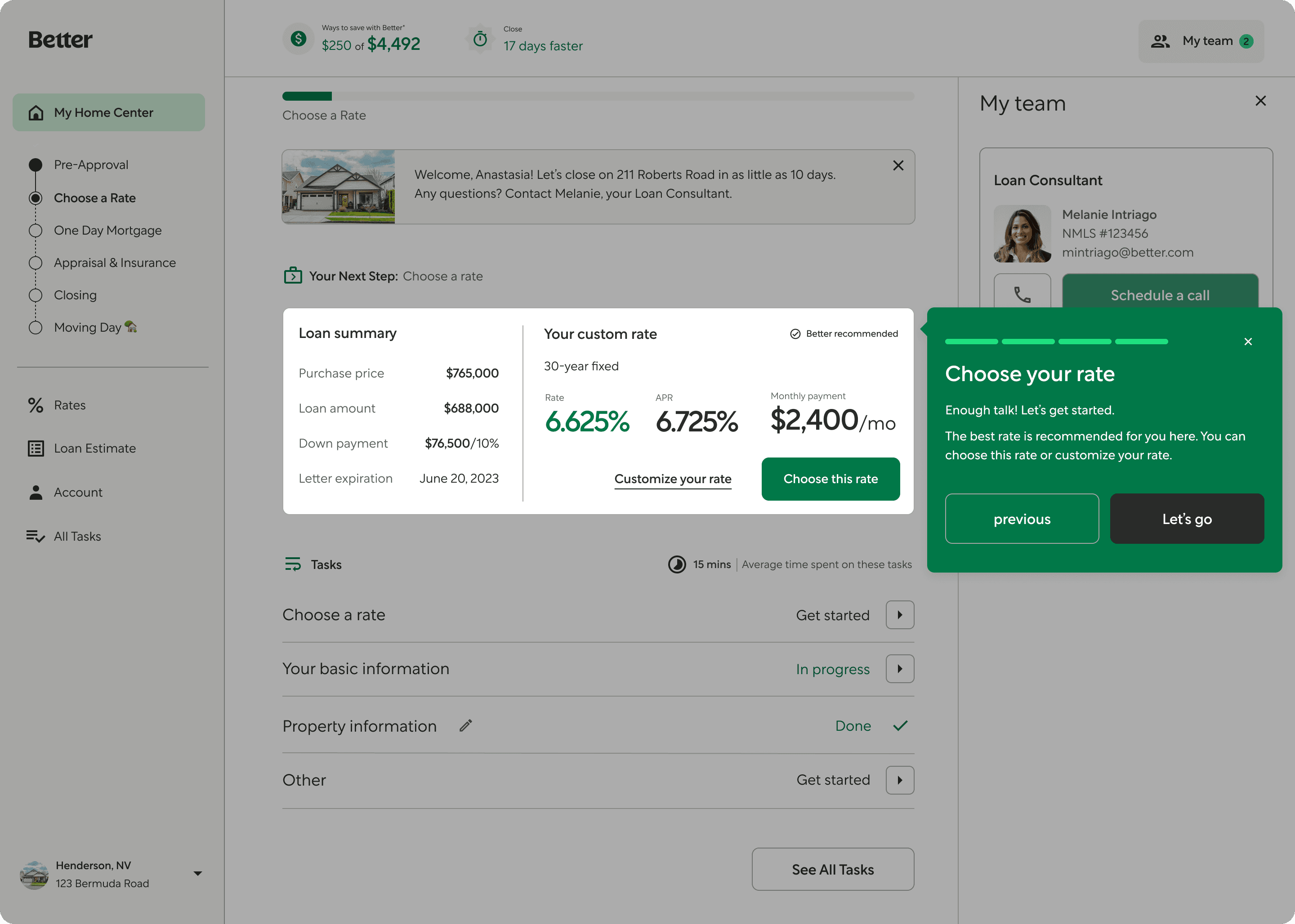
Step-by-Step Walkthrough
Each screen focuses on one key area: Left Navigation, Progress Bar, Team Support, and Choosing a Rate. This ensures users aren’t overwhelmed and can absorb information at their own pace.Consistent Visual Framing
A centered green modal with bold headlines, short paragraphs, and CTA buttons (“Next,” “Let’s go”) ensures readability and familiarity as users progress through the intro.Interactive & Guided Flow
The use of “Previous” and “Next” buttons gives users control over the pace, while the visual progress bar at the top shows how far along they are in the walkthrough.Contextual Highlighting
Each card appears directly over the section it explains — for example, the team card appears near the “My team” panel — helping users mentally link the UI with the purpose.Friendly, Actionable Language
Copy like “Enough talk! Let’s get started.” and “Call them anytime” builds trust while being approachable — ideal for users unfamiliar with finance.
Why this works
Why this works
Reduces First-Time Friction: Users don’t have to “figure things out” — they’re guided clearly from the start.
Builds Confidence: By showing the value of each section, users feel more in control of the mortgage journey.
Encourages Action: Ending with a rate selection step and a strong CTA motivates users to immediately begin their application.
Features of final design
Step-by-Step Walkthrough
Each screen focuses on one key area: Left Navigation, Progress Bar, Team Support, and Choosing a Rate. This ensures users aren’t overwhelmed and can absorb information at their own pace.Consistent Visual Framing
A centered green modal with bold headlines, short paragraphs, and CTA buttons (“Next,” “Let’s go”) ensures readability and familiarity as users progress through the intro.Interactive & Guided Flow
The use of “Previous” and “Next” buttons gives users control over the pace, while the visual progress bar at the top shows how far along they are in the walkthrough.Contextual Highlighting
Each card appears directly over the section it explains — for example, the team card appears near the “My team” panel — helping users mentally link the UI with the purpose.Friendly, Actionable Language
Copy like “Enough talk! Let’s get started.” and “Call them anytime” builds trust while being approachable — ideal for users unfamiliar with finance.