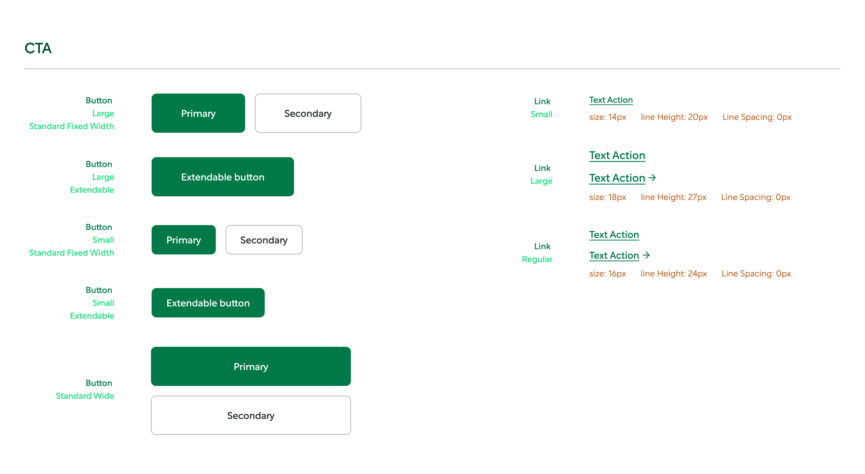
Designed a new templetized design system for all emails, which helped in standardising the design which aligns with the better design guidelines as well as making it easier for non designers (marketers) to design emails which look professional and adhere to the brand guidelines.

Since this was my first time working on a design system specifically targeting marketing, it was essential to analyse of the types of designs which are being circulated by our direct and indirect competitors.
I utilised an amazing source in the form of reallygoodemails.com to find relevant emails and brought them together to study them.
I further went ahead and also subscribed to marketing updates from a few of these competitors.
With enough examples of emails at my disposal, I dove deep into analysing emails one by one.
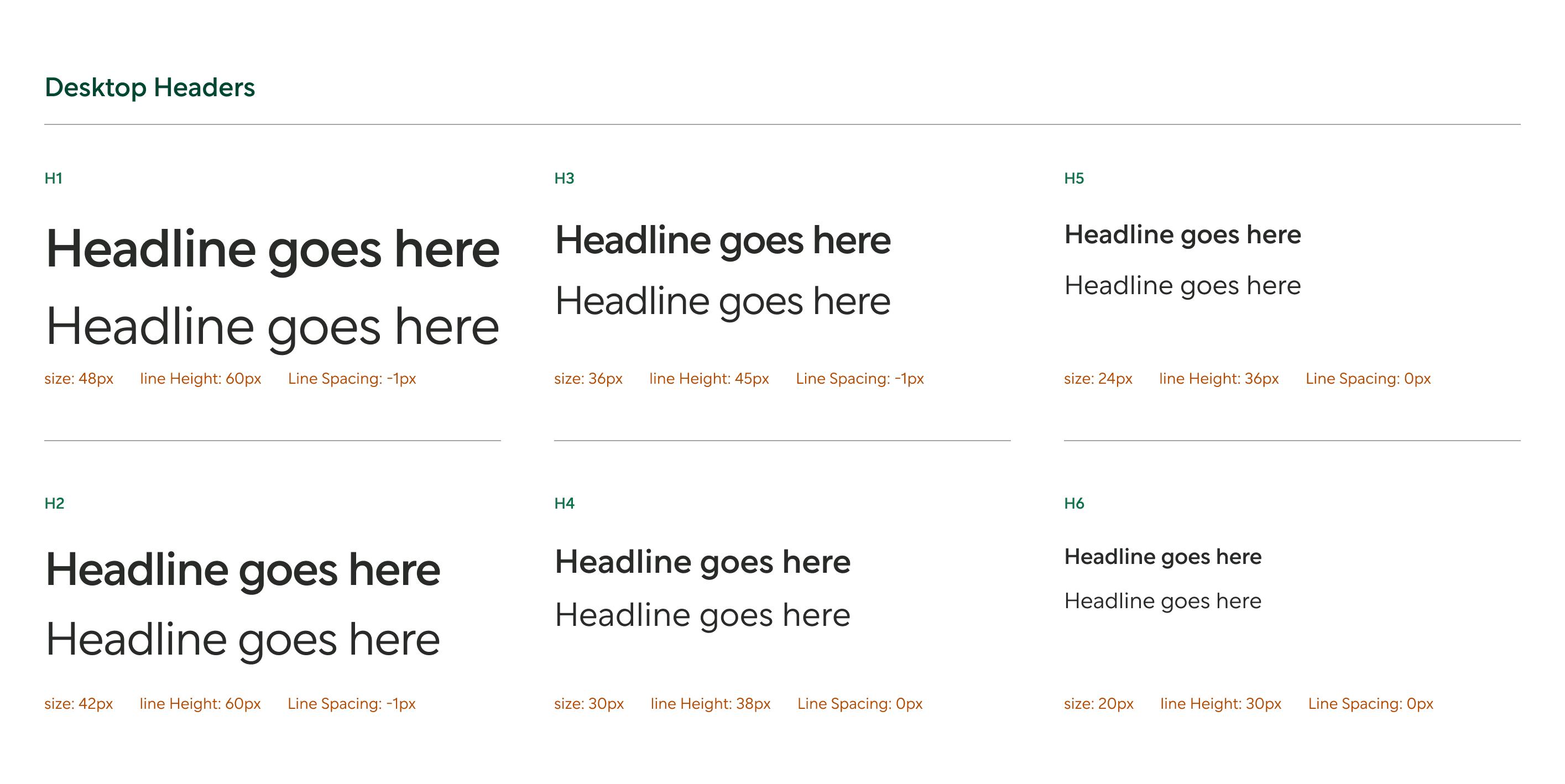
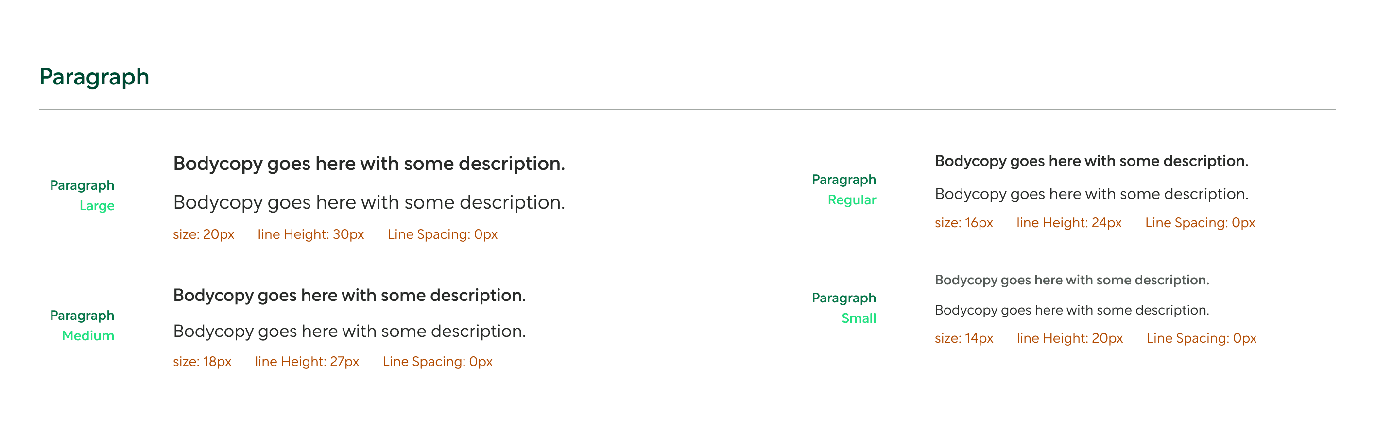
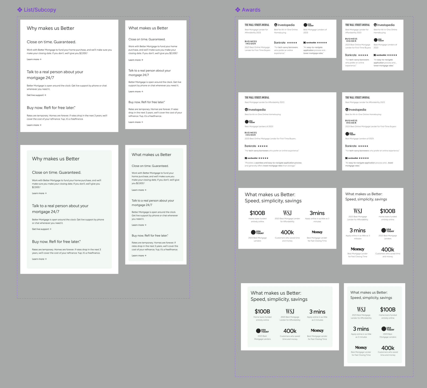
From a design perspective it was important to understand how these emails are structured, i.e. the layouts, typography, images/vectors, buttons and the use of colours.
I approached the marketing team to understand why our competitors are creating the kind of content they are creating and also understand their requirements as we move ahead with the design system.
Clearly convey the messages and use relevant words which align with the subject of the email.
Include modules which are interactive (polls, quizzes, etc.)
Components must be simple enough for the marketing team to be able to work with them and fit the content to design relevant emails.
Designs should be easily converted from desktop to mobile and vice versa.

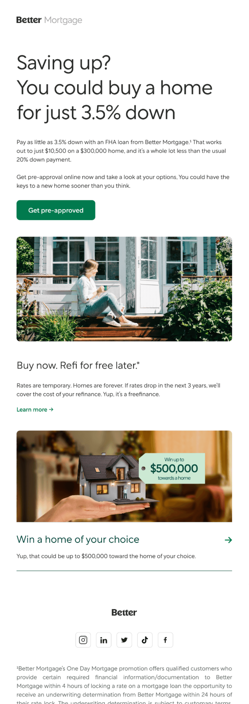

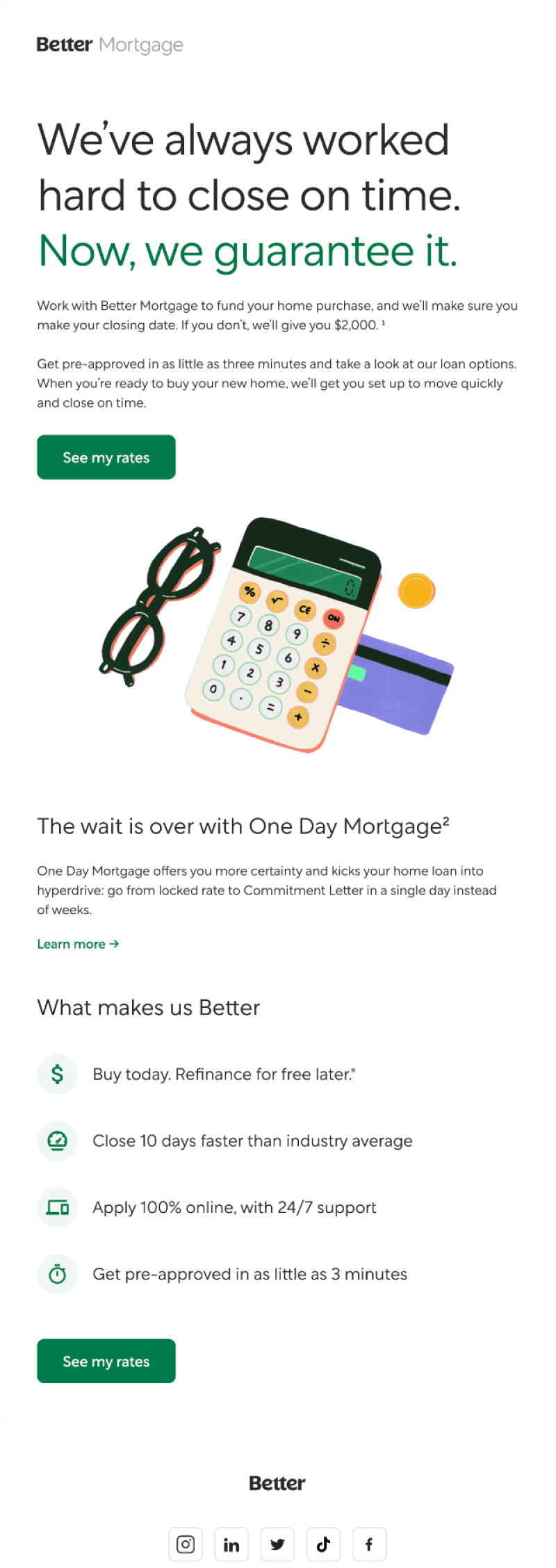
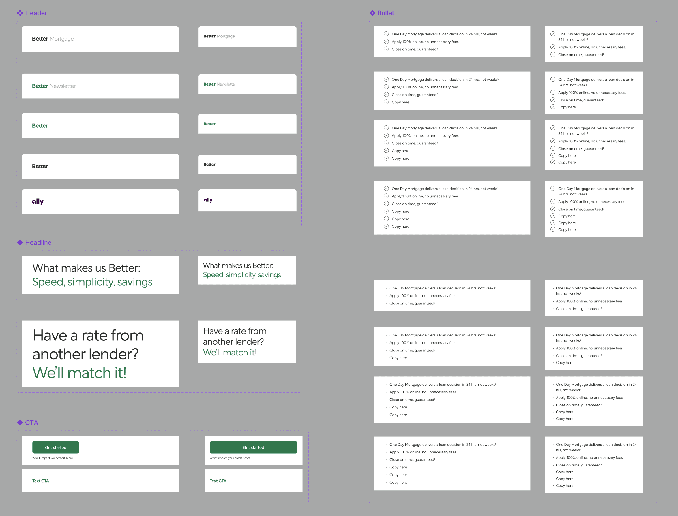
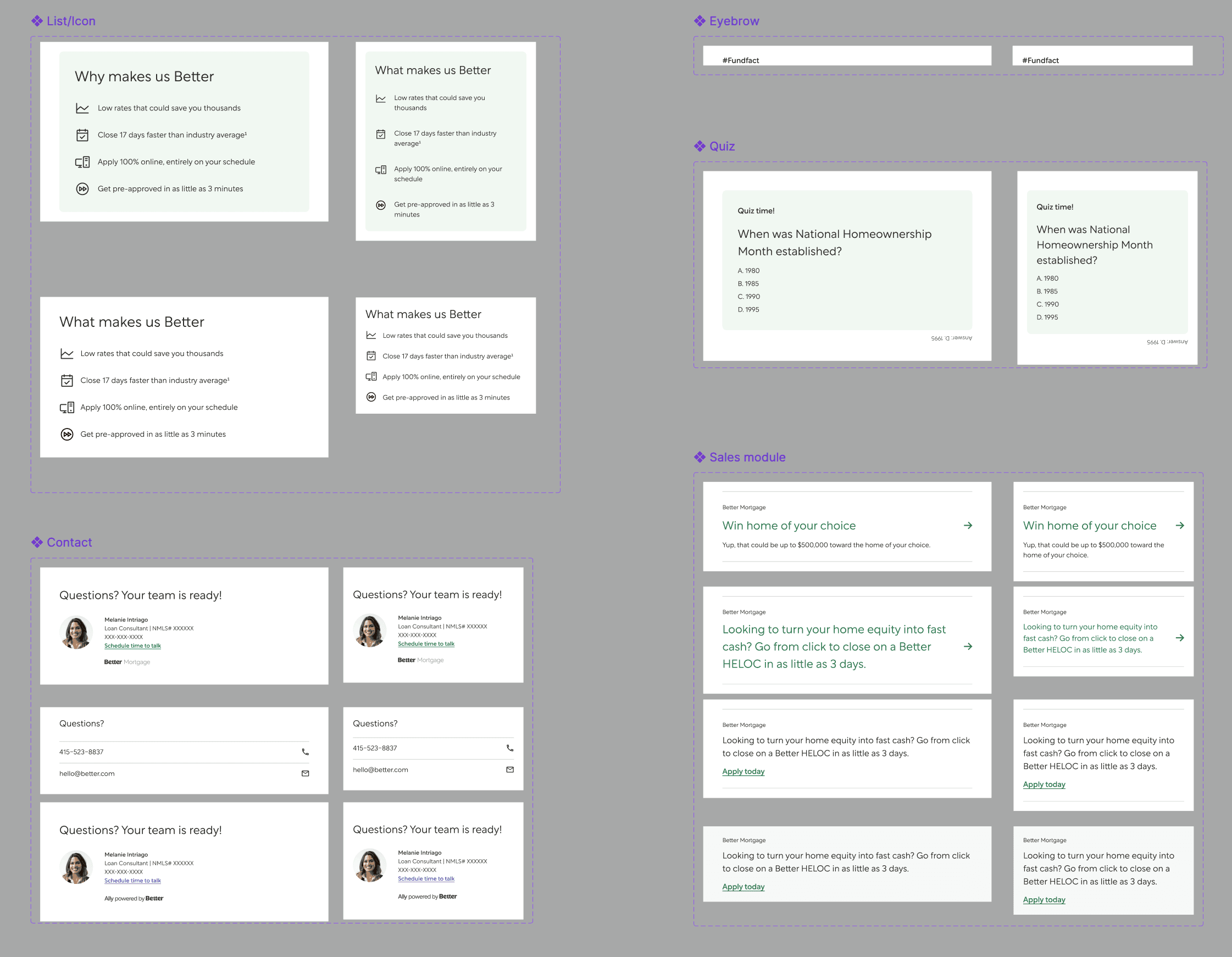
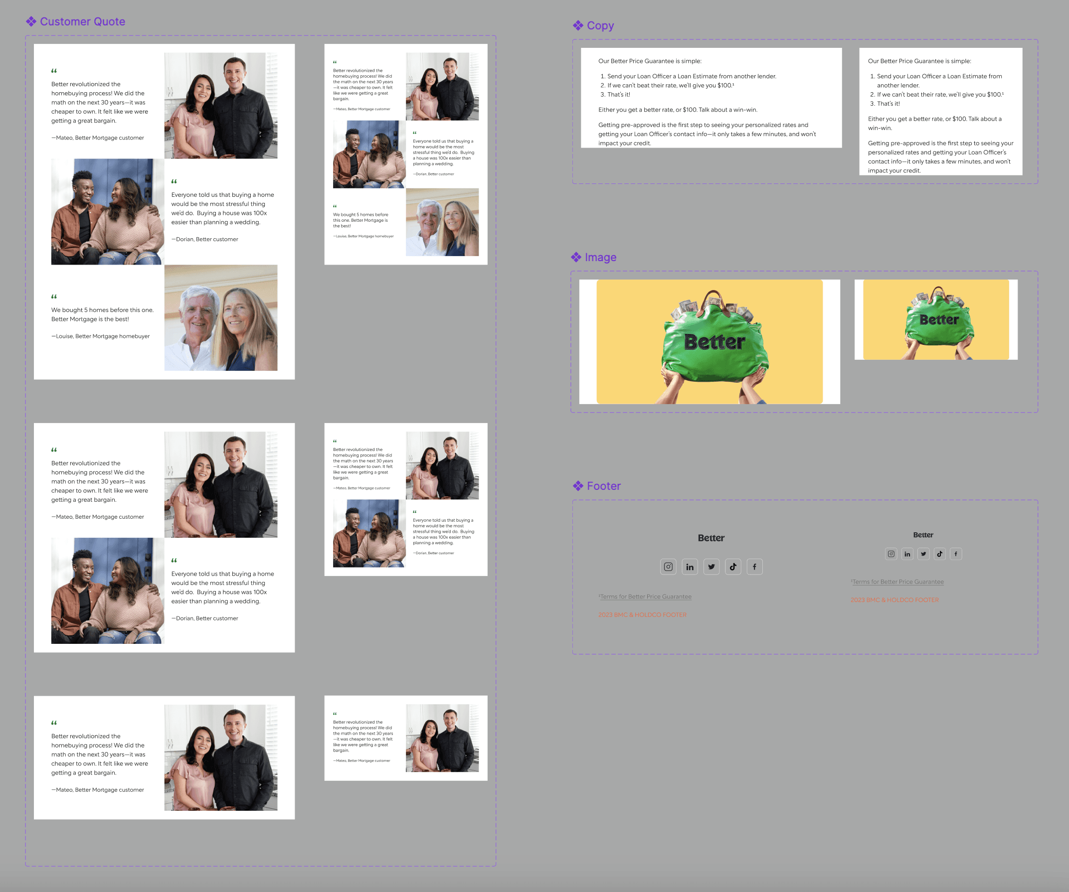
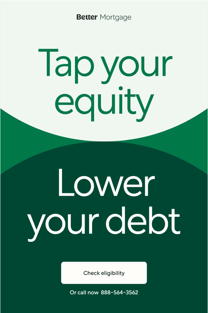
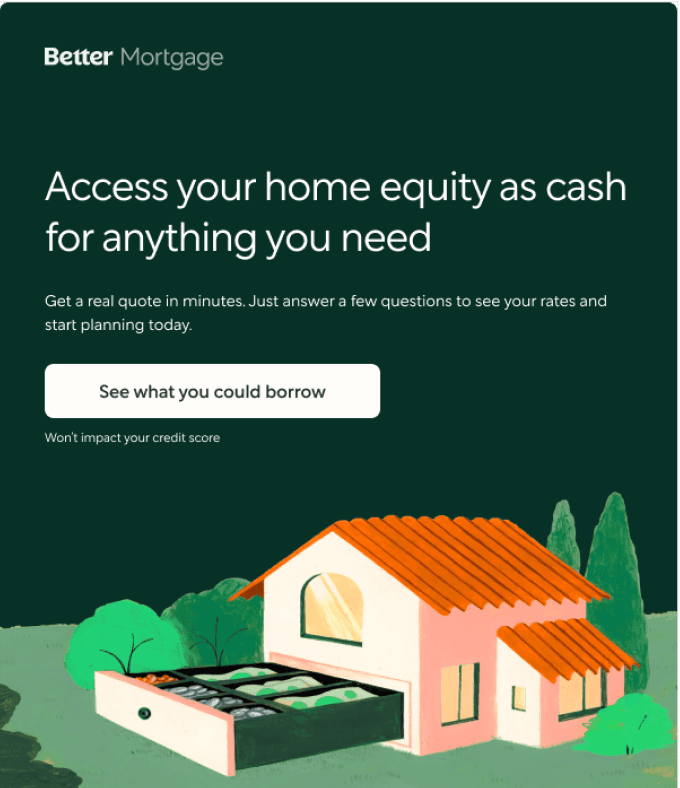
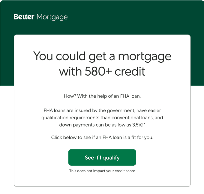
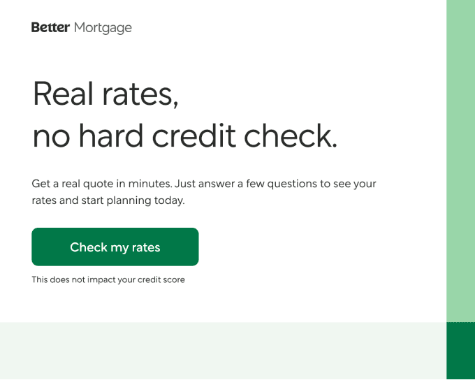
Apart from the fully templatized versions of the emails, I went on with creating a few templates for the hero sections to break away from the monotony and keep the designs fresh while maintaining brand consistency.